
sikka.ai Design System
.jpg)
Project Overview
A design system is a collection of reusable components, guided by clear standards, that can be assembled together to build any number of applications, and the need for them go hand in hand with the need for scale, efficiency, and consistency in Design. They basically bring order to chaos. I created the sikka.ai Design System to maintain that order at sikka.ai. In this project you will see some of the components I built for this design system but a design system is much more then just a component library. If built correctly it is the foundation of your products. Take a look at what I put together below.
Project Execution
Foundation
You don't start building a house without it's foundation so the same thing applies to design systems. The structure is pivotal to outlining the designs of sikka.ai. The foundation of a design system is your spacing and grid system. I feel like spacing and grids are some of the most overlooked elements when it come to visual design but they can make a huge difference in the look and feel of a design. For this project I went with an 8pt grid system that consists of a 12 column grid and an 8px baseline grid. For the spacing system I went with a rem based guide that aligns with the 8px grid. The reason why I went with an 8pt system is to help the design system be more responsive because all of the top screen sizes are divisible by 8 on at-least one axis. This is important as it will help prevent anti-aliasing.


Typography
For web I wanted to go with a clean and versatile font for this system. I chose Lato for the display and Inter for the body, header, caption and action texts as the geometric shape of the letters and the spacing between characters is perfect. It's also super versatile having several variations in weight which make it look great as a heading font and as body text, which can further establish the sikka.ai branding.

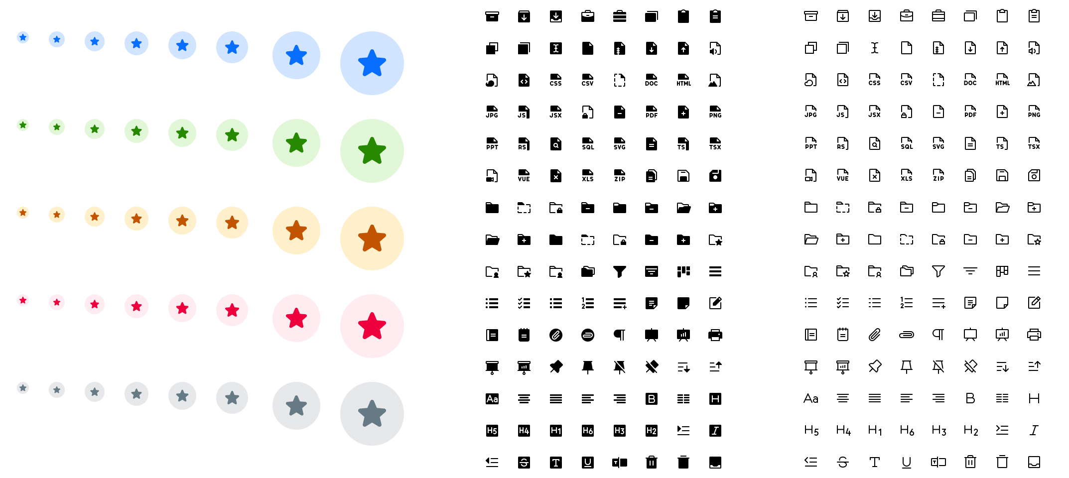
Iconography
Icons within the sikka.ai line of products act as a visual aid to help users complete tasks. In the sikka.ai design system I went with the Phosphor icon library because it's simple, informative, and complements the overall visual language of the design system. Going with a simple icon set reduces cognitive load as opposed to going with more detailed icons. I focused on simplicity to help users understand the concept the icon represents and recognize icons on smaller screens.
Color
Color supports the purpose of the content, communicating things like hierarchy of information, interactive states, and the difference between distinct elements. To me colors should have meaning and be selected intentionally. Not based on what you like or what you think looks good. sikka.ai intends to have every color fulfill an assigned role, which hold a specific meaning based on how they function within the interface. By defining the color roles it makes things easy to modify and customize later. They also extend the color system so it works across multiple touchpoint.

Buttons
We all know what buttons are, but what many non-designers fail to realize is that a single button will have several different states. The most common being active, hover, focus, and disabled. You will also occasionally see a loading state. I decided to use all five of those states in sikka.ai along with different button types. You can see some of the buttons in a few of the different states below.


Inputs & Dropdowns
These are very similar to buttons in the sense that they need to accommodate several different states. One of the biggest things I try to keep in mind when designing form fields is accessibility. Making sure that they title of the field doesn't go away when selected, and that there are more indicators then just color for errors are all common considerations. There are also other components like dropdowns, radios, checkboxes, toggles, and others that are essential to have.

Other Components
Here are additional components that are used for a variety of design scenarios and serve to be versatile. At sikka.ai, having the flexibility of setting up designs that assists on representing the brand presence of sikka.ai along with serving as a design guideline for business partners and contractors to comply with.

Light & Dark Mode
To provide additional features for users, this design system also factors in light and dark mode versions of components.


Designs
At sikka.ai, think of our Design Systems like a big puzzle. Each piece is unique, but they all fit together to create a bigger picture. What I've shown you today is just a few pieces of that puzzle. To really get the whole picture, there are many more pieces to explore and fit together:
.png)
Documentation
Think of this like an instruction manual for a toy. It's a shared space where everyone can look up when and how to use the design system. It makes sure everyone is on the same page and uses the system correctly.
Visual Language
Imagine if our brand was a person. The visual language is like that person's personality and vibe. It's a guide that tells us what the brand should feel like whenever we see it or interact with it.
Pattern Library
Sometimes called the "component library", this is like a toolbox filled with all the tools (or visual pieces) we need. What I've shown you earlier is just a small glimpse of what's inside this toolbox.
Brand Guidelines
This is our brand's playbook. It's more than just logos and colors. It includes the principles we stand by, the tone and manner in which we speak, our unique writing style, and much more. It ensures that our brand feels consistent everywhere it shows up.
Results
Next Steps
Building on our conversation about sikka.ai's design system, the journey ahead involves delving deeper into each component. Start by familiarizing yourself with our comprehensive documentation. Think of it as our communal playbook; it's where we've outlined the specifics of when and how to utilize our design system most effectively. Collaboration is key, and this shared space ensures everyone is aligned and moving in the same direction.
Furthermore, immerse yourself in our visual language and brand guidelines. They embody the essence of sikka.ai, and understanding them is pivotal. Our pattern library, which is akin to a versatile toolbox, is filled with diverse tools awaiting exploration. Familiarity with each element will empower you to create designs that resonate with our brand's ethos. As we proceed, it's essential to keep our brand's voice and tone at the forefront, ensuring a consistent and authentic representation across all touchpoints.
